This update covers new infections in select countries and worldwide through 03/20.
During the 24 hour period of 03/20, cumulative confirmed infections increased:
US up 38% to 19624 (from 14250)
Italy up 15% to 47021 (from 41035)
Iran up 7% to 19644 (from 18407)
South Korea did not provide updated numbers today
China up <1% to 81286 (from 81193)
Spain up 14% to 20410 (from 13622)
Germany up 30% to 19848 (from 15320)
France up 15% to 12612 (from 10871)
Wordwide infections are up 13% to 275452 (from 244517)
Note: Today, we’re adding Spain, Germany, and France to countries we’re reporting on.
The “US Saturation Date” is now April 20.
The US Saturation Date is based on the current daily infection growth rate of 38%, which coincidentally, lines up almost perfectly with the average US infection rate for the entire month of March.
Comments:
Today US infections increased by over 5000 cases for the first time, and total US deaths jumped by 57 to 260 (up 28%). The US is currently ranked the 6th highest country by number of total infections, and is set to pass Germany and Iran tomorrow to take the 4th rank worldwide. While China’s 81286 infections firmly claim the #1 rank, Italy has more deaths (4032) than China (3259). Italy added 627 deaths in the past 24 hours, increasing their death total by 16%. The US, Italy, Spain, Germany, and France all had death increases of more than 25% today.
That’s a lot to take in. Charts are so much easier to read, so we’ll continue on there.
First, we’ll digest the numbers we just covered, starting with deaths rates in antural scale
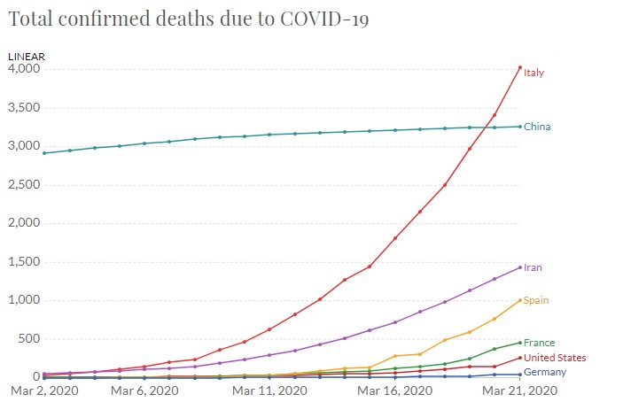
I decided to cover deaths first because the information is now starting to show clear worldwide trends. In natural scale, it’s quite clear how Italy, Iran, and Spain have much work to “flatten” their curves. The US and Germany are still experiencing relatively low numbers of deaths, which may well indicate that both countries are early in their overall curve– but could also indicate that an early flattening of this curve could be possible.
The chart below shows the same death rates in a logarithimic scale, so we can more accurately see how quickly (percentage wise) these deaths are exponentially growing.
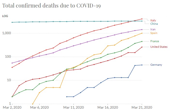
In this chart, the growth rates are more clear. I need to mention that due to timezone differences and test result schedules, the US and Germany’s increases over the past 2-3 days seem staggered. Interestingly, in this chart, you can start to notice how the exponential growth of Iran and Italy may be starting to slow.
The chart below shows confirmed cases in natural (linear) scale.
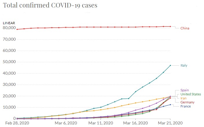
In natural scale, it’s clear that infections in Italy are well beyond what are in other countries. The US is nearly lost in the mix as confirmed infection totals of many of these countries are well within the same range. This chart should be viewed knowing that cases take time to confirm, and are subject to the availability of test kits and labs.
The chart below shows total infections to date (same as the chart above) but in logarithmic scale.
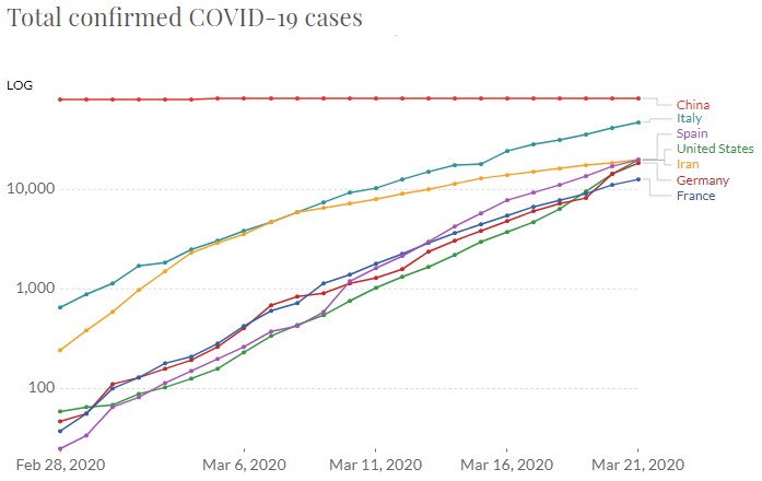
Note how the US, France, Spain, and Germany all appear to have similar infections, infection rates, and timelines. Italy appears to be continuing up with only the slightest downward bend in the line detectible. Iran seems to be moving out of “exponential growth” phase, which is great for them. It’s possible that they’re having issues with test availablity, however, the trend seems to be holding over the past several days.
The following chart is a natural scale of how infections and deaths could grow if the current US infection growth rate were continued until everyone in the US is infectected.
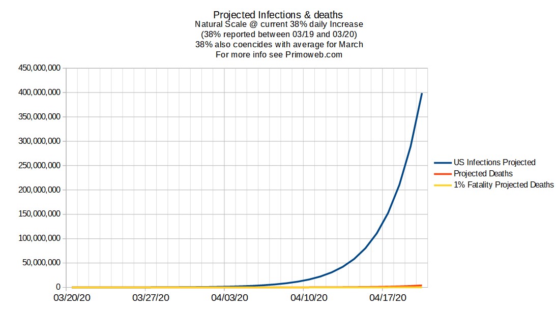
This chart, although scary looking, only shows a couple of things. Infection rates grow rapidly after about April 10, and can’t possibly grow at this rate past April 20. Long story short, once things reach a certain tipping point, the math is really against against you. I’m more interested in how what this means for deaths, so on to the next chart.
The following chart is the same as above, in logarithmic scale. It’s a pure projection of continuous 38% infection growth.
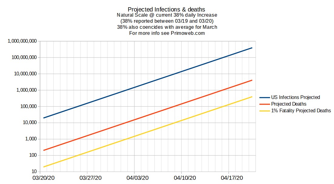
In this scale, the chart above is much easier to see the two lines on how we can project potential deaths. The red line starts at current death rates, and scales and grows at the same 38% the infections grow using this method. The yellow line is based on a predicted “1% fatality rate”, meaning that instead of starting with 200+ infections currently in the US, we continually stay at 1% of the blue line. So you can see that by April 3rd, there could be anywhere between perhaps 2000 and 10,000 deaths. Take note that deaths may lag from 7-11 days behind infections and this chart does not take that into account. I eventually will do that, however, currently the blue line only represents people “tested and confirmed” and it’s almost certain that there are cases in the wild that have not been tested.