I’ve been posting daily updates and charts related to COVID-19 (Coronavirus). Today, I’ll keep it more brief, as I’m devoting more time to producing better and more informative charts– so I’ve got a whole new system I’m working on that will hopefully be used for tomorrow’s numbers (fingers crossed).
As of 03/19, the infection rates are as follows:
US up 52% to 14250 (from 9369)
Italy up 15% to 41035 (from 35713)
Iran up 6% to 18407 (from 17361)
South Koreak up 1% to 8652 (from 8565)
China is up .07% to 81193 (from 81137)
Worldwide infections are up 12% to 244517 (from 218777)
Worldwide infections (not including China and South Korea) are up 20% to 154672 (from 129075)
Comments:
US reported infections are growing at an artifically fast rate this week, as new testing facilities are able to work a backlog of tests– in the long run, this is a good thing, however, the current US Saturation Date of April 14th, is very unlikely to be accurate. I still believe that earlier projected dates in late April or early May are worth noting. Another observation is that US infections broke 10K today, and well may break 20K tomorrow. The US death toll landed at 203 today and we may see another 50-75 deaths come in tomorrow, purely from a numerical standpoint. Projections show that 1000 total US deaths are possible within the next 7 days.
My home state of Oklahoma reported a death today of a 55 year old pastor, previously in good health with no major illnesses or diseases beforehand. Keep in mind that things we may consider minor like obesity, high blood pressure, and even arthritis can play a role in COVID-19 fatalities.
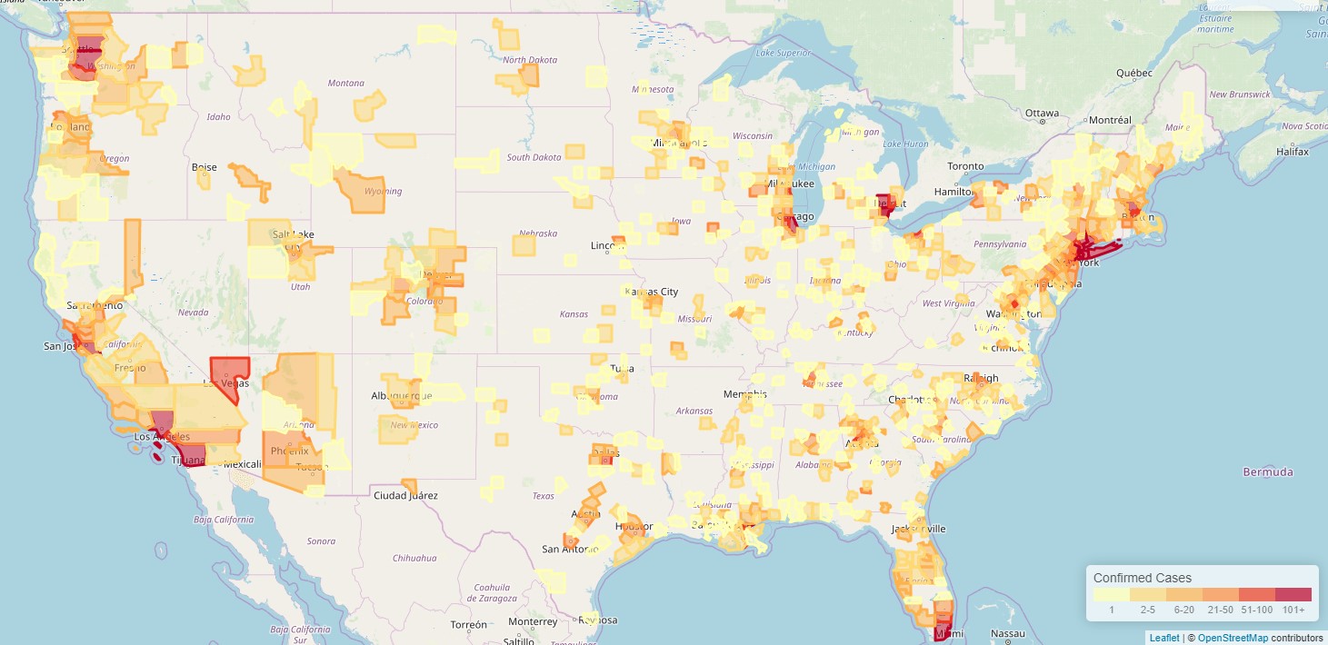
When I look at the numbers on a US map, the bigger cities seem to be hit hardest, with New York City reporting nearly 28% (3954) of the total US cases (14250) and 13% of the deaths. King County Washington (Seattle area) represents 5% (693) of total US cases, but nearly 30% if the deaths. By these two areas alone, you can see that the outcomes of this virus are varied. I’m no epidemiologist, so I’ll leave the how’s and why’s to them.
I’ve made a chart today to compare a few countries total COVID-19 deaths and how they compare with worldwide COVID-19 deaths.
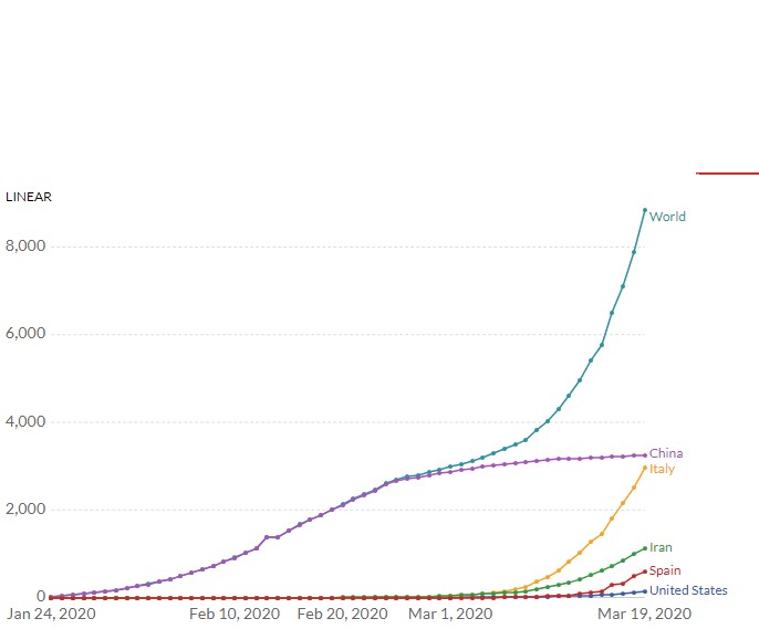
This chart, in natural (linear) scale shows you a lot. You can see where Italy’s number of deaths are nearly equal to China’s, and likely to surpass them. If you compare the growth of the world and the Italy lines, it’s obvious that Italy’s new deaths are driving most of the worldwide deaths and China’s numbers are flat. Iran, who at first appeared to be getting a handle on the virus, no longer appears to be doing as well, while Spains line is definitely growing, and not smooth at all, which may point to a problems confirming cause of deaths in a timely fashion. The big takeaway here is that based on other countries where deaths started taking off, you can see where the US is clearly early in the chart– US numbers could change rapidly.
The chart below is the same data, in logarithmic scale, and provides more insight into what’s going on.
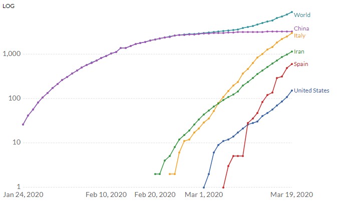 In the above chart, you can see how worldwide deaths, are again growing exponentially (remember, a straight line pointing up on a logrithmic chart, represents exponential growth, where the higher angle represents a higher percentage of growth each day).
Italy is obviously growing at the highest exponential rate, where the US and Iran’s deaths are growing at about the same rate. In logarithmic scale, you can clearly see how spain is set to overtake Iran’s numbers soon, but, because of their erratic rates, it’s hard to predict whether they’ll overtake italy.
One overall takeaway in this chart is that clearly, all countries represented are pointed in the direction that will easily surpass deaths in China.
In the map below, you can se US infections, color coded by county. The darker red counties collectively represent most of the infections in the US.
That will conclude my charts for 03/08. I’ll resume projections hopefully tomorrow, but since the US has issued guidance that this weeks “projections” will be off due to increased testing capacity coming online, I’ll spend more time working on a better charting system than producing alarming looking charts that likely don’t represent reality.
As always, I create these reports so that you all can get a good feel for the direction we’re heading and can take solace knowing that the world around you isn’t grinding to a halt for no reason at all. I’d love to give you all an idea of when this will start to subside, however, the Chinese numbers are (as we’ve discussed before) suspect, so we’ll have to take their numbers with a grain of salt.
If you have any questions or want to contact me, I can be reached at (joe @ primoweb.com) or facebook.com/primoweb
Keep calm and carry on.